When it came to their Manhattan pied-a-terre, a New Jersey couple could not have asked for a better location: overlooking Central Park, a mere stone’s throw from Lincoln Center. But the apartment itself was about as classically nondescript as the 1960s-era landmark high-rise in which it was housed. “It’s the kind of building that bridges the gap between modernist and brutalist,” notes designer Michael Aiduss, whom the couple, upon retiring and selling their suburban home, hired to transform their occasional abode into a full-time residence.
While the 1,200-square-foot space wasn’t quite cramped, the original floor plan made the interiors feel heavy and oppressive, with a zig-zagging layout, awkwardly placed walls and doorways, and a lack of natural light in key spaces–all conspiring to diminish its proportions.
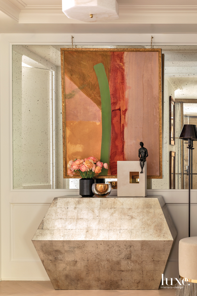
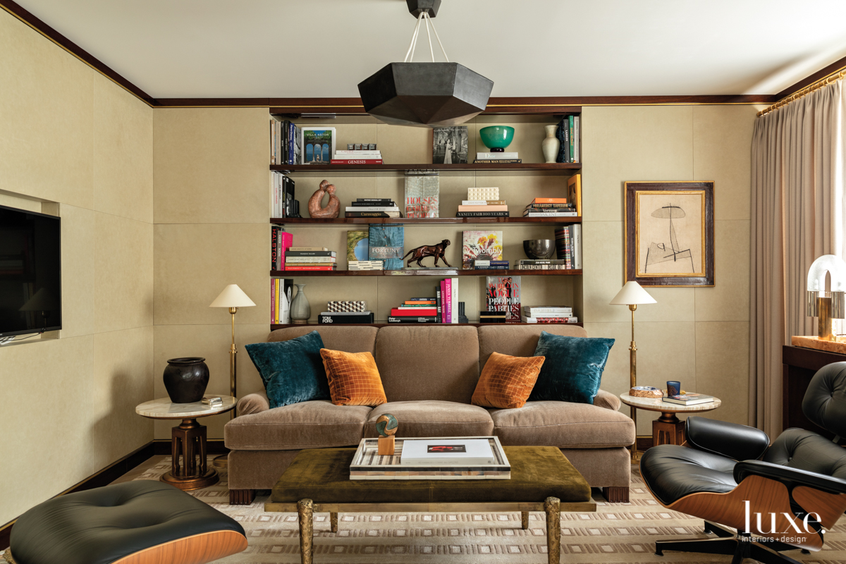
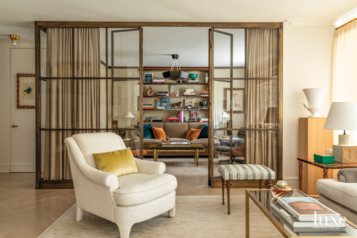
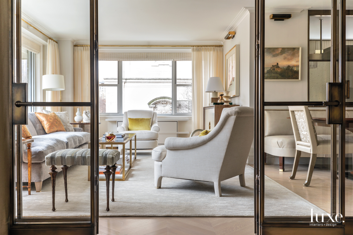
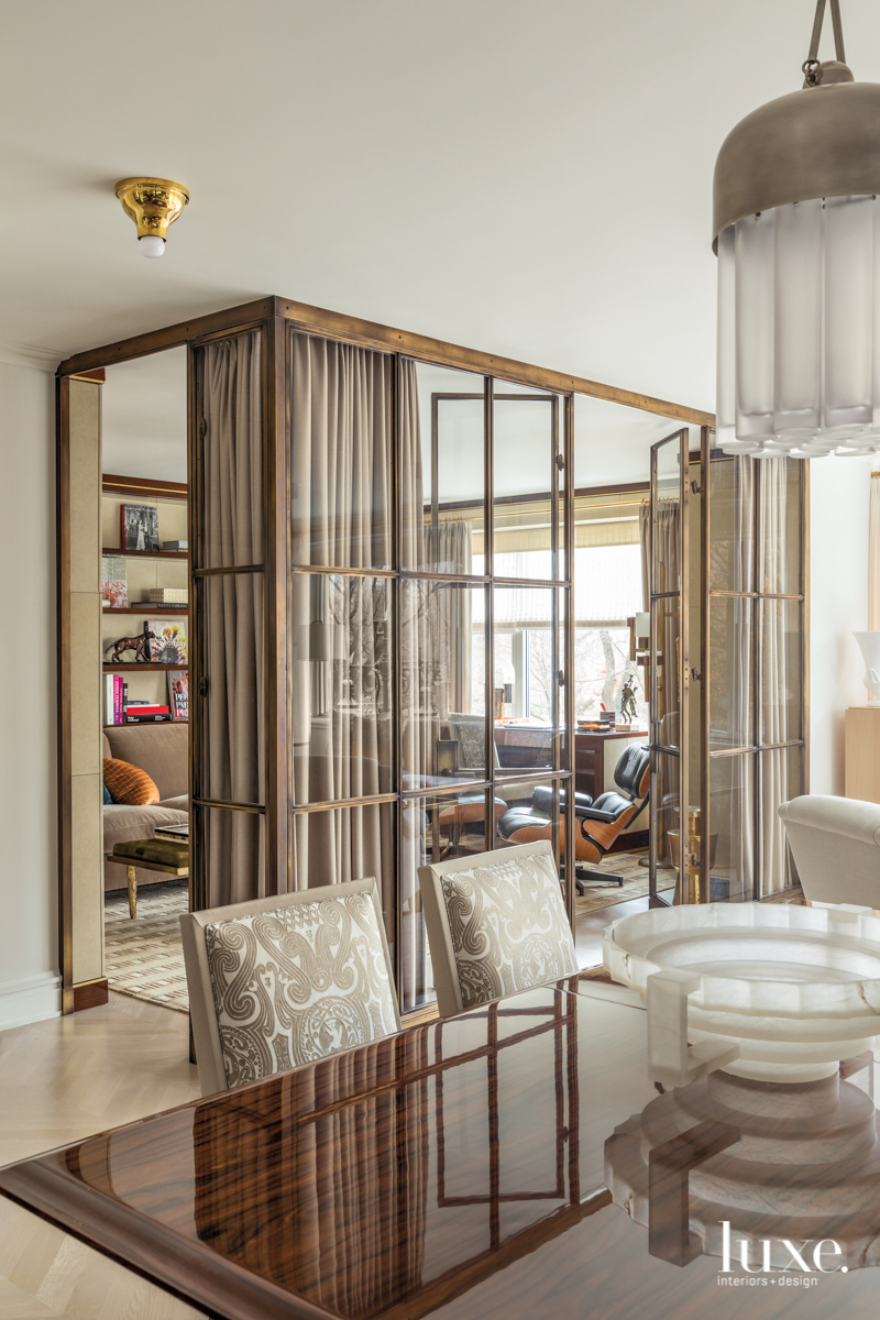
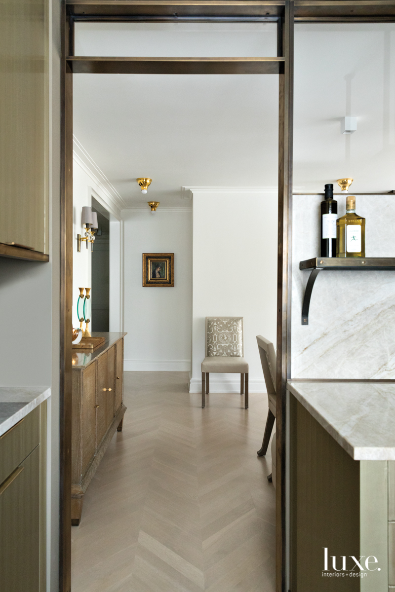
In order to make it feel more open and expansive, Aiduss reconfigured the space by tweaking the unremarkable layout and cleaning up the architectural sight lines. High-gloss panels with mirrored interiors concealed doorways. Glass-and-bronze partitions replaced standard-issue walls in both the kitchen and the library (which was originally a rarely used second bedroom), creating a sense of vastness. “I wanted to replicate the feeling of an open layout while retaining the ability to exist in different rooms,” Aiduss explains. “By creating more intimate areas, we were able to make the ceiling height feel taller.” In the previously stifling entryway, Aiduss cleverly used antiqued mirrors to impart a sense of light. “Mirrors were a big necessity in terms of making the space appear larger,” he says. “Architecturally, it all feels more sound now.”
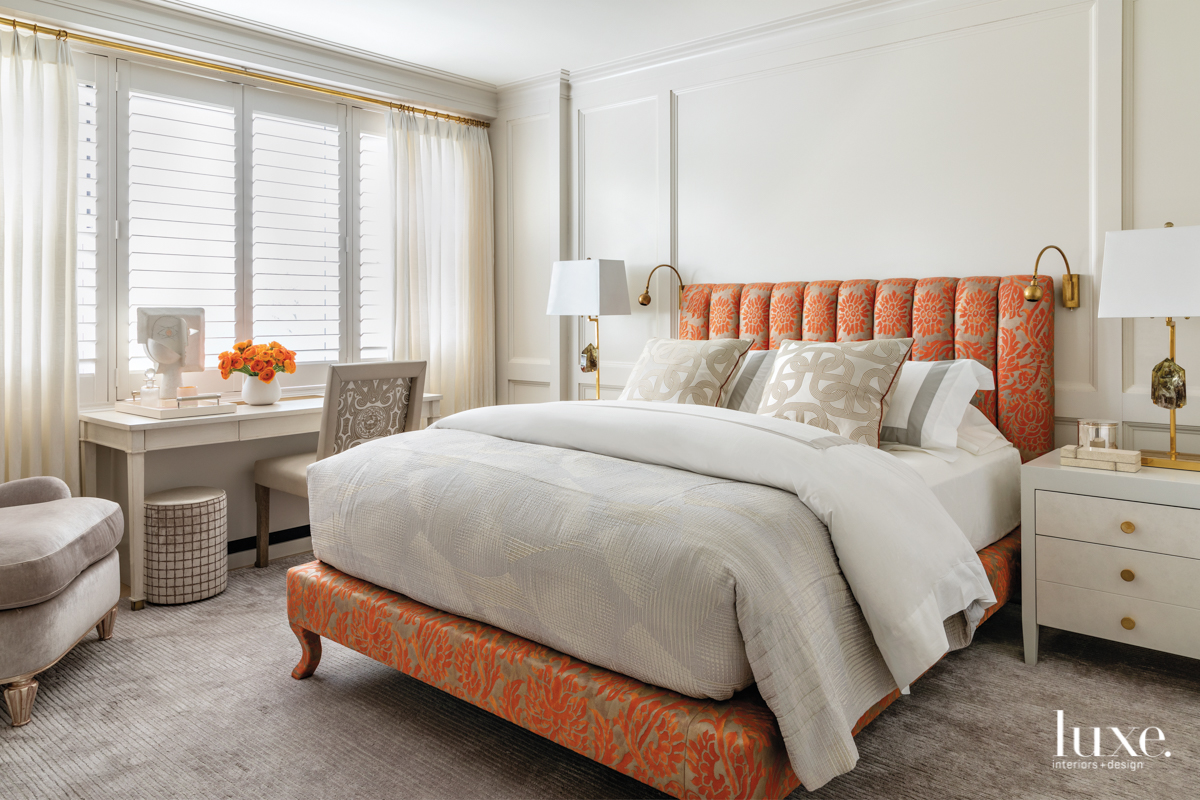
In keeping with the apartment’s modernist roots, the designer chose a crisp palette of whites and beiges. “I love color, but the space is not large, so the neutral palette allows you to have this exchange with the park and enjoy the seasonal changes from wintry white to bright green,” he says, noting the apartment’s prime views of the park and a picturesque carved-limestone church. “It allows you to exist in the apartment and feel very serene.” Still, Aiduss could not resist including a few subtle strokes of color, particularly in the master bedroom where a burnt-orange-and-gold headboard offsets a blush-lilac carpet. “The color is offered in more reserved doses, making the space feel more livable,” notes the designer.
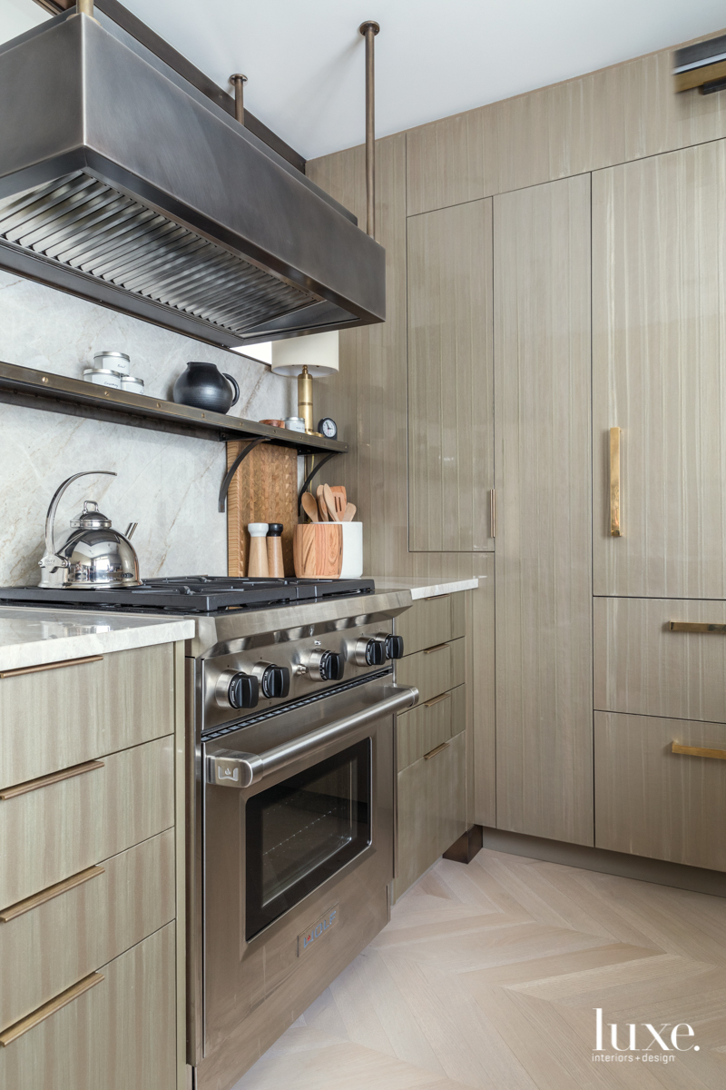
By incorporating luxe finishes throughout, Aiduss not only brought a sense of depth and richness to the minimalist palette, but also paid tribute to the couples’ love for old New York-style interiors: plaster moldings, gleaming white oak chevron floors, leather-clad walls and mahogany finishes in the library, and metallic flourishes everywhere, from the curtain rods and table legs to the light fixtures and nailhead trim on the dining banquette. In the kitchen, an artist scrupulously hand-painted the cabinets with 16 coats of lacquer, creating a textural, multidimensional finish that reflects several shades at once–khaki, gold, green and gray.
“The client wanted the apartment to feel incredibly beautiful and as luxurious as it could be without being over the top,” Aiduss says. “It’s small, but when you’re inside it feels so well appointed. Every closet you open, there’s a beautiful interior and it’s very tailored. There are no secondary spaces. Each one is primary and well done.”
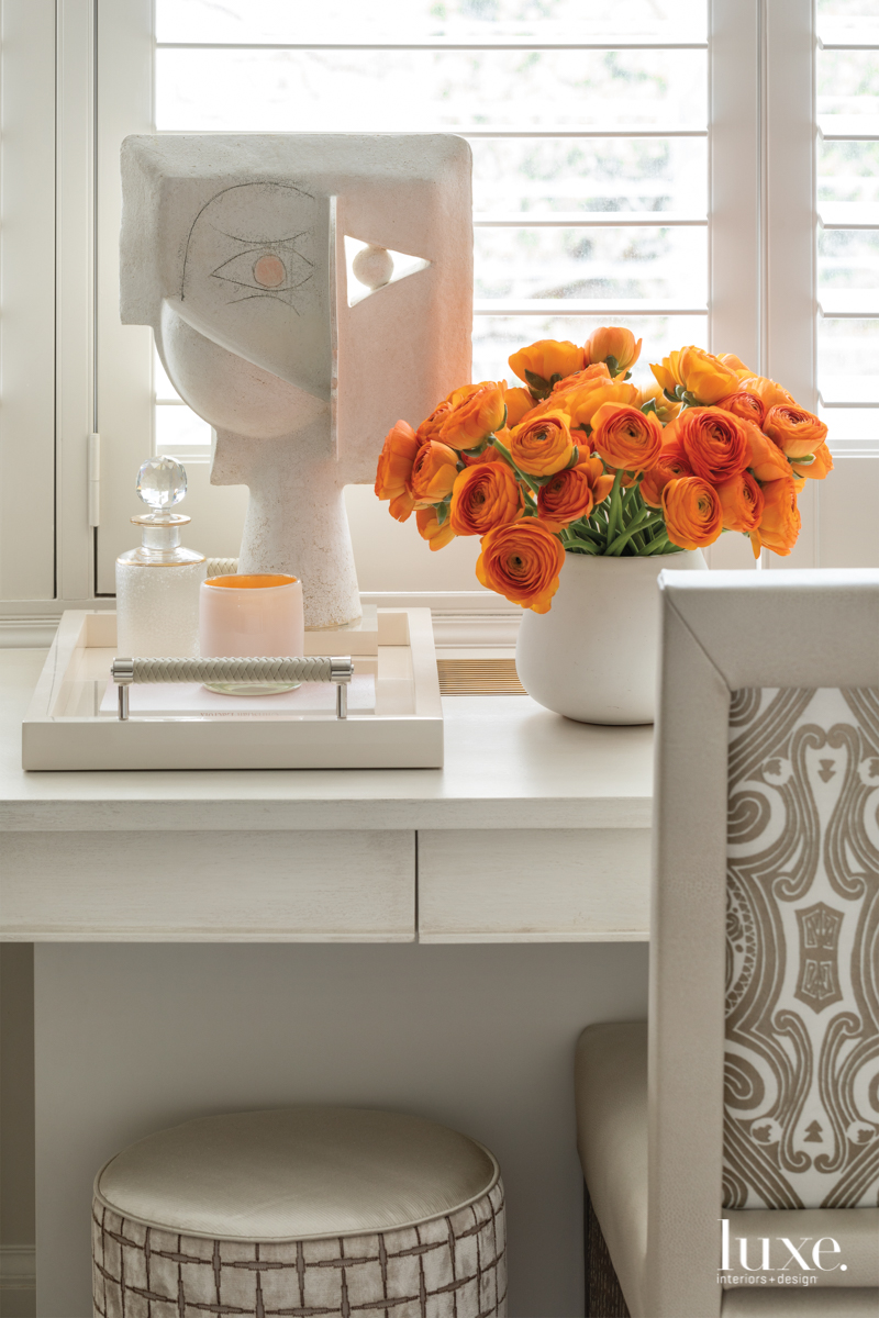
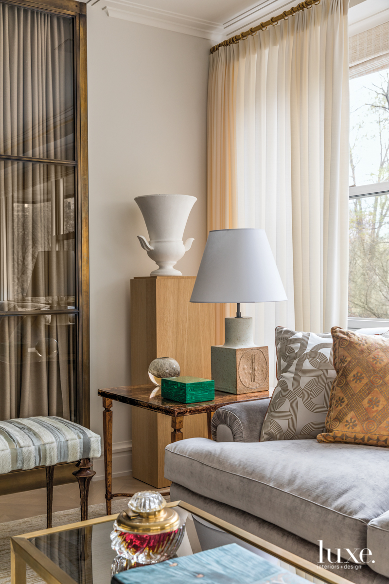
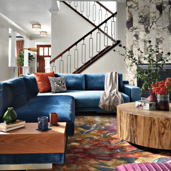
The furnishings also reflect a seamless marriage between modern and classic, balancing clean lines and subtle shades with the more sinuous silhouettes of a glamorous bygone era. “To complement the atmosphere of architectural grandeur, it was important to me that every item of furniture should be sculptural, a beautiful object to look at,” says Aiduss, who designed many of the pieces, from a mahogany-legged sofa and bronze-framed cocktail tables in the living room to a Jean-Michel Frank-inspired sideboard and an intricately veined rosewood dining table. The latter, which features a cantilevered base with gilded accents and a black marble plinth, is one of the more showstopping pieces. Based on 1960s Italian designs, it sits alongside a banquette on one side for a more fluid feel. “The client didn’t want a bunch of dining chairs clustered around the table,” says Aiduss. “Now it can also serve as a presentation table for flowers or books.”
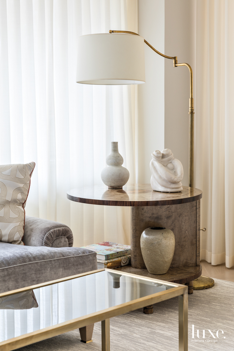
Other pieces he found in the antique markets of Paris and London: a gilt-bronze-and-goatskin table in the library, for example, and in the living room, a pair of 1950s Bruno Gambone ceramic lamps and a 1930s Swedish grace-period marquetry table. By refusing to hew to any one style in particular, Aiduss’s design evokes an overall vibe of tailored timelessness. “It’s inspired by the 1930s, the ’40s, the ’60s,” he says. “It’s a combination of efforts, which to me is the most successful aspect– it’s not too much of one thing.”

