For Kathryn and Andrew Collins, it was a best-case scenario: A newly built house wearing the classic detailing of the vintage homes in San Mateo, California, but with an open layout and generously scaled spaces that make it ideal for a young busy family. The couple loves historic homes but possess a personal style that’s fresh and modern–an aesthetic they share with their designer, Emilie Munroe. “We have a common design language,” Munroe says of her clients. “The house has traditional elements, but with a collected, layered feeling. It reminds me of fashion designer Jenna Lyons’ style. She’ll wear classic designs but with sequins sewn on.”
The couple purchased the Dutch Colonial-style home as the dry wall was going up, allowing Munroe to incorporate crisp details with unexpected flourishes within architecture inspired by homes in the surrounding historic district. Home builder Greg Gambrioli, who worked with architectural designer Tim Raduenz of Form + One to create the residence, says that nearby homes many built in the 1920s, provided inspiration for classic elements such as decorative corbels under the eaves, a gracious trellis and diamond-paned windows. “It was very important for me to do the ‘X’ detail in the windows, like one of the homes I saw in the neighborhood,” Gambrioli says of the distinctive pattern. “I love the craftsmanship and those kinds of details.”
Although she came on the project toward the end of construction, the designer was able to tailor the interiors. “We loved everything Greg was doing,” Munroe says. “I added to that (and had a blast) by picking out the elements that are special to the clients.” Those items include personality packed items such as lighting that’s dripping with porcelain beads, kitchen hardware with backplates that make a statement, bold colors (think deep-blue built-ins in the study) and wallcoverings (like the chic grass cloth in the master suite) that are framed within Gambrioli’s oversized moldings and coffered ceilings.
One of the most important spaces was Andrew’s office. “He works a lot of hours,” Kathryn says. “After years of working at the kitchen table, we wanted to make it a really special place, a sanctuary.” Munroe responded with a room that’s dressed like a man’s suit, with a plaid rug and walls covered in Italian wool. The custom walnut desk has internal sockets and cord storage, so its beauty is unhindered by the messy business of technology. “It was really exciting for Kathryn and me to collaborate with Andy on this space–it had a fun energy around it because of that,” the designer says.
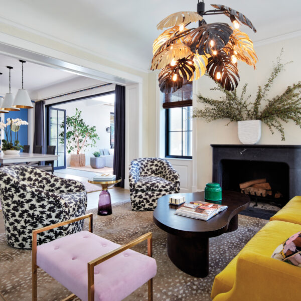
Throughout the home, bold, modern details mingle with softer, classic elements. Munroe animated the black-painted trim on the windows with charcoal and gray accents throughout the main living areas. “We love adding dark accents to homes, and this project is a great example,” she says. In the sun room, a ladylike space adorned with a leafy patterned wallpaper, a delicate light fixture hangs from a sky-blue ceiling. It’s adjacent to the foyer and living room, where the more tailored profiles of a clean-lined sofa and marble cocktail table dominate. In the casual areas to the rear, a stylized gray floral pattern covers the dining room walls and black basket pendants hang over the kitchen island. “That kitchen could have felt more formal, but the oversize scale of those lights makes it unexpected,” Munroe says.
The designer explains that the mix of color, pattern and natural materials distinguishes each space, yet allows them to complement one another in the open floor plan. “The goal is to have stone, metal, leather, glass and woven elements in each room,” she says. She adds that “little pops of happiness” are injected into the mix–such as the emerald-dipped mudroom and a powder room papered in a riotous pattern of fruit and foliage.
In addition to those joyful notes, the designer adds moments of nature via houseplants. “I call them interior sculptures,” Munroe says, noting that she chooses each for leaf shape and color tone. “They bring softness. They’re an essential part of a complete design for any home,” she says, “especially because they integrate the interiors with the outdoors.”
Outside, landscape designer Sarah Small took charge of the long, narrow lot with structured plantings all around. “It was a design to reflect the nice, tailored architecture,” Small says. Low, clipped boxwoods and lily of the valley shrubs line the front façade’s foundation, “so you can still see all the architectural lines,” she explains. More boxwoods, hydrangea, rose bushes and flowering vines–all in a restrained green-and-white palette–march around the rest of the house. “As you’re in the house and looking out, you have a nice sense of the garden moving all the way around,” Small says. “The whole garden is meant for each window to have a nice view.”
Munroe added attention-getting exterior details to energize the ensemble–including a lipstick-red door, a cheerful red-and-white mailbox and an inviting porch swing. “Those are playful moments,” she says, adding they provide just the kind of welcome you’d expect from the Collins and their two young children. “Emilie correctly interpreted our young family’s energy and style,” Kathryn says. “It’s fun and modern and interesting–and not generic.”